Step 8 — Read the data four ways
Goal
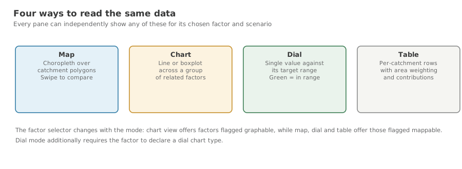
Switch a pane between map, chart, dial and table.
Background
The same selection can be read four ways, and each answers a different question: where, how does it trend, how far from healthy, and which catchments contribute.
Switching view does not change your factor or scenario choices — only how they are drawn.
Steps
Use the pane's own toolbar, bottom-right, to switch modes.
Chart view
A line or box-and-whisker plot of Reference, Current and Target for the chosen factor.
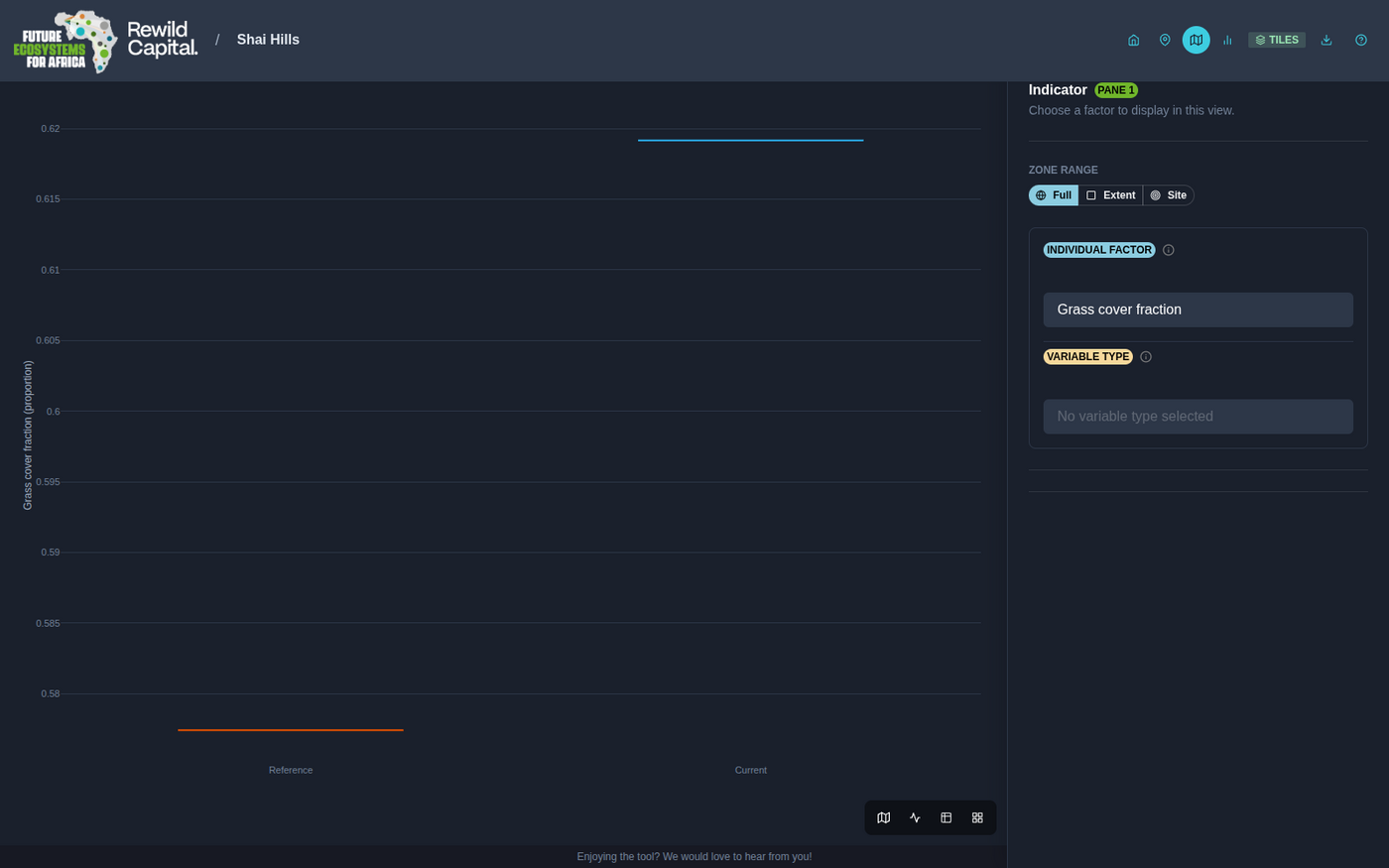
- Summary mode — one factor, one three-point comparison.
- Grouped mode — choose a Variable Type instead of a single factor to chart every related factor at once, narrowing further with a Grouping Variable. A Line / Whisker Boxplot toggle appears when the data supports it. Widely spread axes switch to a logarithmic scale automatically, and large grouped charts paginate.
Dial view
A semicircular gauge for a single factor: an at-a-glance read of how far Current and Target sit from the ecological reference.
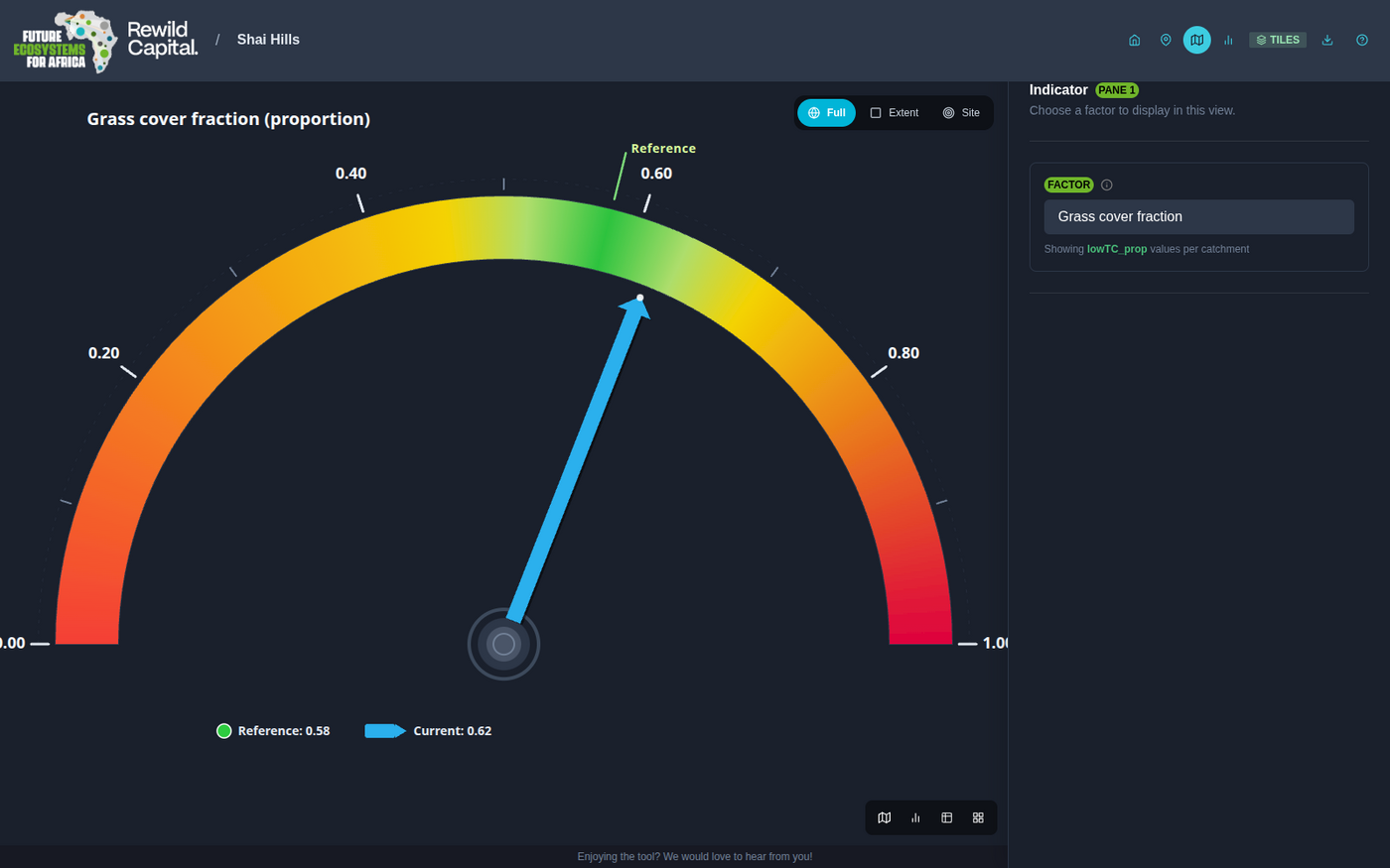
The green band marks the healthy reference zone, fading to yellow and red toward the extremes. The solid blue needle is Current; a dashed green needle appears once Target differs from it.
Table view
The Site Aggregate Calculation — the area-weighted average of the chosen factor across every catchment in the site.
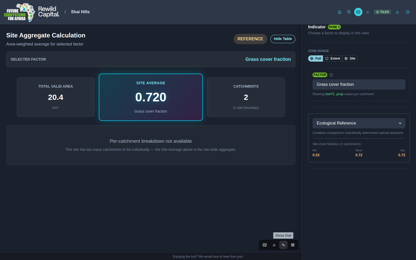
Summary cards show total valid area, the site average, and catchment count. Show Table reveals the per-catchment breakdown with the underlying formula — unless the site has too many catchments to list, in which case only the site average is shown.
What you achieved
- You can switch a pane between all four view modes
- You know which question each mode answers best
- You can chart a whole group of related factors at once