UI Reference Guide
A widget-by-widget description of every interface component in Decision Theatre.
Landing Page
The entry point of the application.

| Component | Description |
|---|---|
| Header | Logos (left); My Sites, Download, Toggle documentation icons (right) |
| Hero section | "Welcome to the Landscape Decision Dashboard" title, strapline, and the Explore the Future of Ecosystem Decision-Making button, which opens Explore mode |
| Supporting landscape management | Auto-advancing screenshot carousel (Dials / Chart / Map / Sites) with descriptive text and The FEFA and Rewild Capital Partnership button |
| Use the Landscape Decision Dashboard to... | Capability strip and four audience cards, each launching a scripted guided tour of a pre-built demo site: Explore Conservation Futures, Explore Shared Landscapes, Explore Policy Impacts, Explore Future Possibilities |
| How does it work? | Guided Tour button (replays the app's onboarding walkthrough) plus a reference/current/target explainer |
| Members of Our Ecosystem | Auto-advancing carousel of partner-organisation logos |
| Feedback link | Persistent footer banner linking to a feedback form (if configured) |
Onboarding Walkthrough
A small draggable card (bottom-center) with a spotlight ring on the relevant UI element, progress dots, Back / Next, and Skip tour. Runs automatically the first time the app loads in a browser profile; restart it anytime from the landing page's Guided Tour button. Covers: Welcome → My Sites → Create a Site → Define Your Boundary → Your Site on the Map → Indicators & Scenarios → View Modes → Documentation.
Your Sites Page
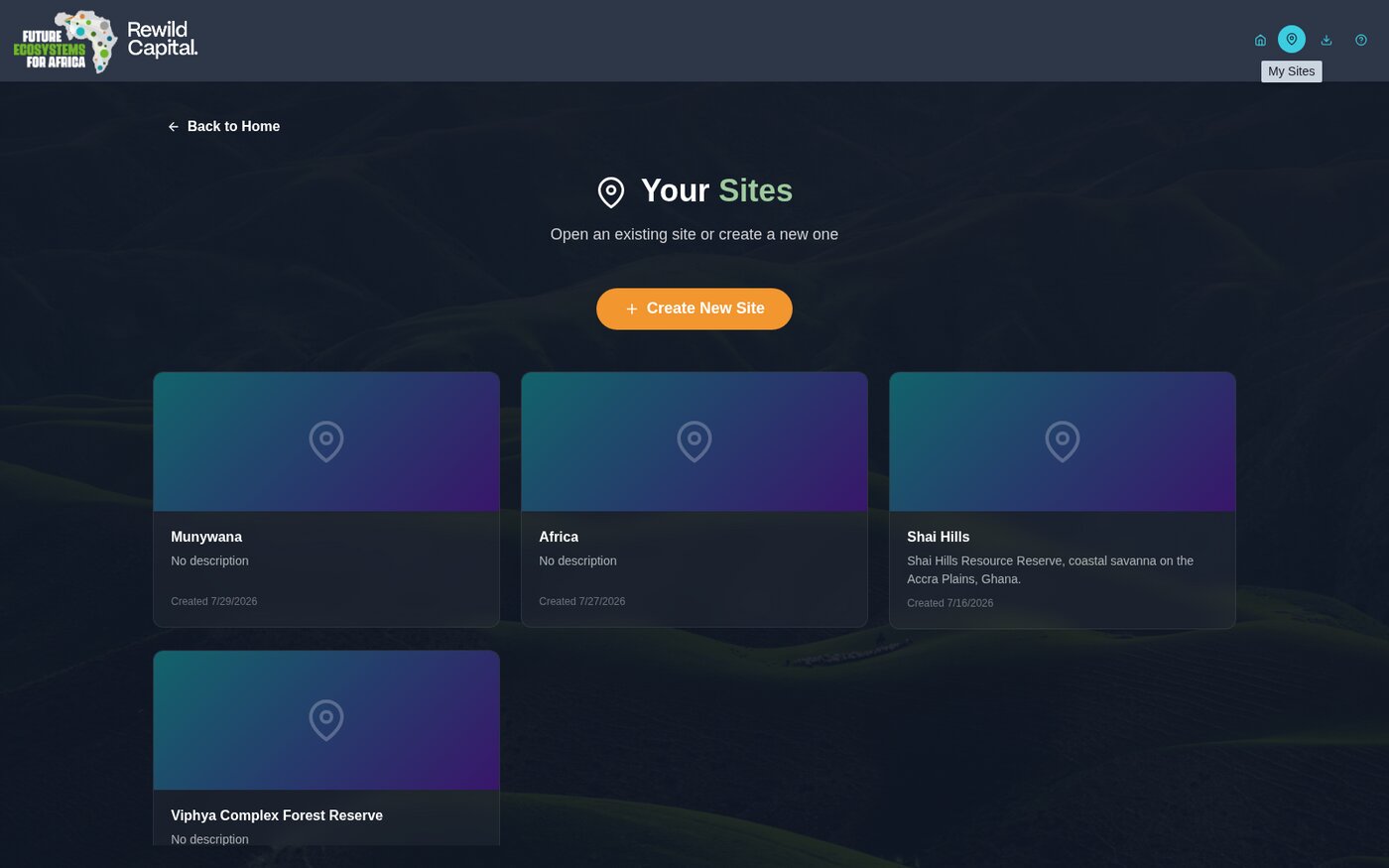
Reached via the My Sites icon (pin) in the header.
| Component | Description |
|---|---|
| Back to Home | Returns to the Landing page |
| Create New Site button | Large primary button, starts the creation wizard |
| Site grid | Responsive grid of site cards (1-3 columns based on screen size) |
| Empty state | "No Sites Yet" card with a Create Your First Site button, shown when no sites exist |
Site Card
| Component | Description |
|---|---|
| Thumbnail | Auto-captured map image, or a gradient placeholder with a pin icon |
| Edit / Clone / Delete icons | Appear on hover; hidden entirely for the four read-only demo sites |
| Title | Site name (truncated if too long) |
| Description | Site description, or "No description" |
| Created date | Formatted creation timestamp |
Create Site Wizard
Three steps, tracked by a stepper in the header (Method → Boundary → Details); editing an existing site skips straight to a single Details step.
Step 1: Method

| Card | Description |
|---|---|
| Shapefile | Upload a .zip with .shp, .shx, .dbf |
| GeoJSON | Drop a .geojson or .json file |
| Draw | Click points on the map to draw a boundary |
| Catchments | Click, or box-select, catchments to merge into one boundary |
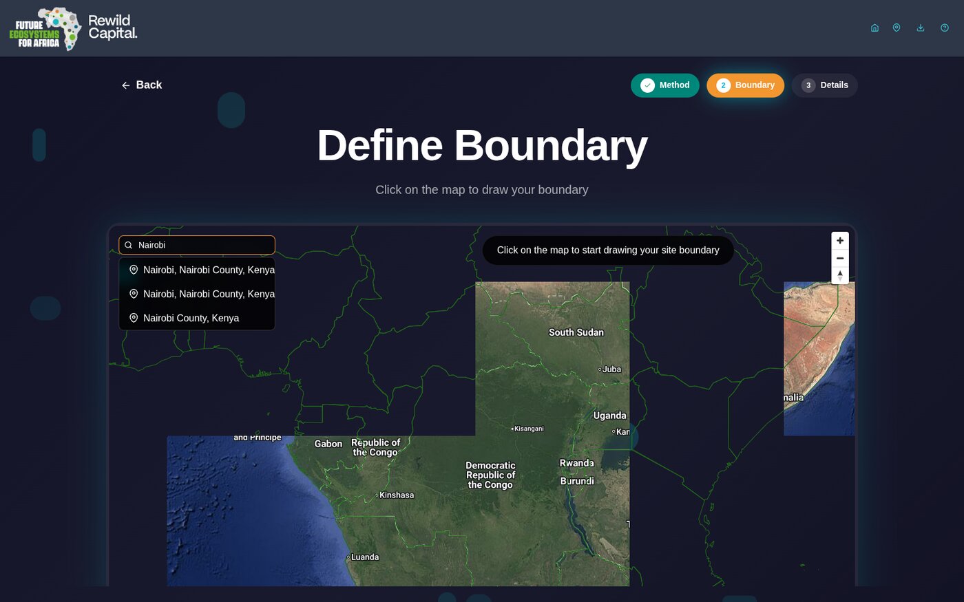
Step 2: Boundary
| Component | Description |
|---|---|
| Location search box | Type a place name (3+ characters) to search; results merge an offline gazetteer with live OpenStreetMap lookups. Clicking a result flies the map there |
| Satellite basemap toggle (globe icon) | Switches between the default vector basemap and Google satellite imagery |
| Instructions banner | Top-center pill; text changes with the current mode and progress |
| Undo / Clear (Draw mode) | Remove the last drawn point, or clear the whole boundary |
| Box Select toggle (Catchments mode) | Drag a rectangle to bulk-select every catchment inside it |
| Clear Selection (Catchments mode) | Appears once at least one catchment is selected |
| Confirm Boundary / Create Boundary | Advances to Details once a valid boundary exists; auto-captures a thumbnail |
Step 3: Details
| Component | Description |
|---|---|
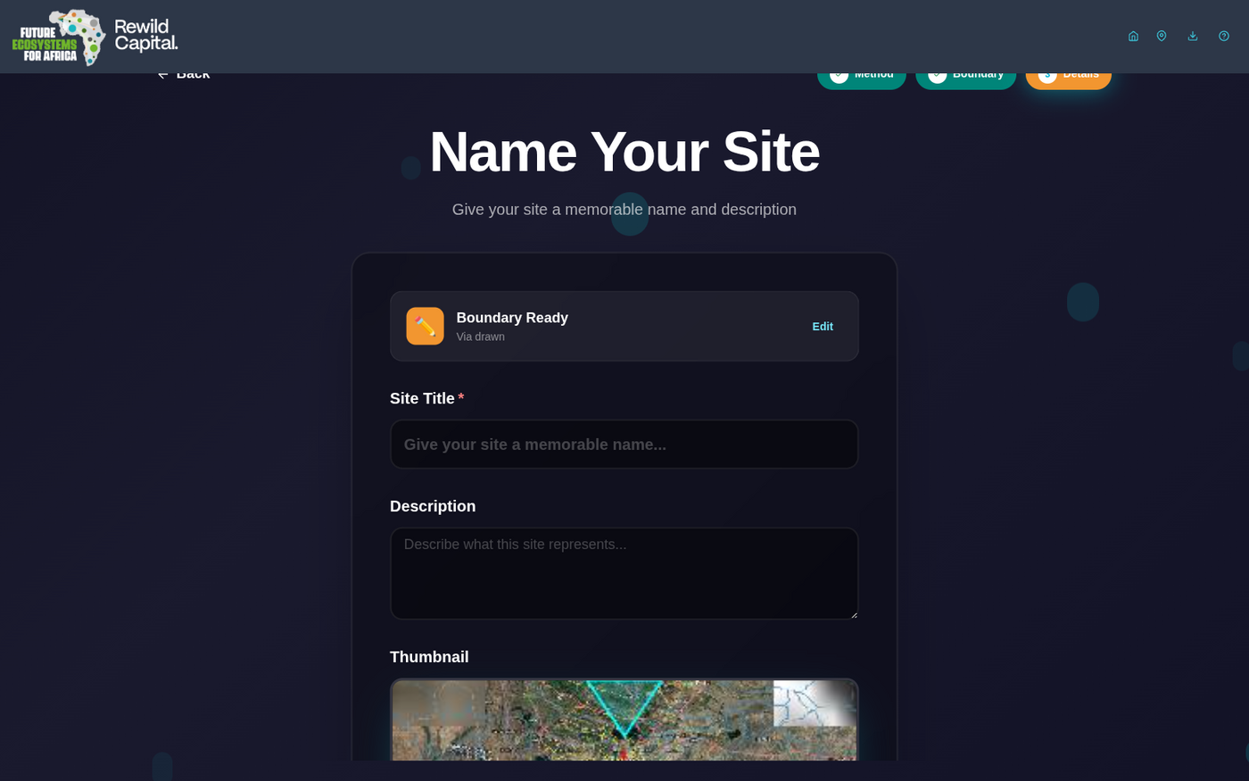
| Boundary Ready chip | Icon, method, and catchment count summary, with an Edit link back to Step 2 |
| Site Title | Required text field |
| Description | Optional multi-line text |
| Thumbnail | Drag-and-drop or click-to-browse image upload (max 5MB); hover for Change/Remove |
| Create Site / Save Changes | Submits the form |
Main Application (Map View)
Header Bar
| Component | Description |
|---|---|
| Logos | FEFA / Rewild Capital branding; clickable to return to the Landing page |
| Site title | Shown next to a "/" separator once a site is open, with an Edit site pencil |
| Edit site boundary (pencil, map page only) | Toggles boundary edit mode |
| Home icon | Returns to the Landing page |
| My Sites icon (pin) | Opens Your Sites |
| Map view icon | Returns to the map from the Indicators page |
| Indicators icon (bar chart) | Opens the Indicators page for the open site |
| Tiles status badge | Green when map tile data is loaded, gray when missing |
| Download icon (browser runtime only) | Opens the Download page |
| Reinstall data pack icon (desktop runtime only) | Reopens the Setup Guide |
| Documentation icon | Opens/closes this documentation panel |
Map View
| Component | Description |
|---|---|
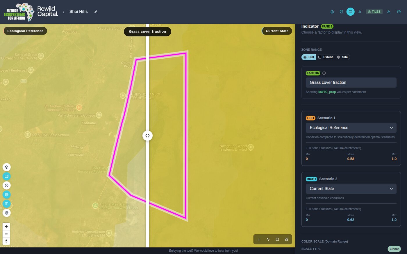
| Map canvas | Two synchronized MapLibre GL JS map instances (one per compared scenario), rendering vector tiles from the local MBTiles |
| Swipe divider | Draggable vertical line separating the two scenario maps; docks to an edge when dragged close to it |
| Choropleth | Colour overlay for the selected factor, driven by the active colour scale |
| Site boundary outline | Magenta outline of the open site's boundary, when a site is loaded |
| Zoom / compass controls | Standard MapLibre zoom in/out and bearing-reset, bottom-left |
Per-Pane Map Toolbar
Floating vertical toolbar, left edge of each map pane:
| Control | Description |
|---|---|
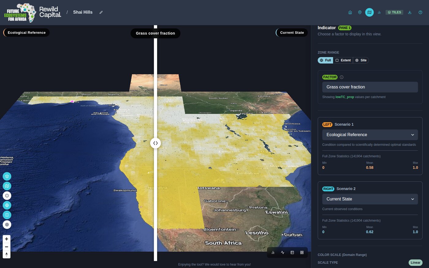
| Toggle 3D view | Extrudes catchments as 3D bars scaled to the factor's value, tilting the camera to 60° |
| Toggle choropleth layer | Shows/hides the colour overlay |
| Toggle identify mode | Click-to-inspect a catchment (single-pane view only) |
| Toggle Google basemap | Switches to/from satellite imagery |
| Toggle map swiper | Shows/hides the swipe divider |
| Zoom to Site | Fits the view to the open site's boundary |
Per-Pane View-Mode Toolbar
Floating toolbar, bottom-right of each pane -- buttons for every other view mode than the one showing (Map / Chart / Dial / Table). In grid view this also offers Calculation details, Focus this pane (maximise), a 2x2 / 2x3 columns toggle (first pane only), and Remove pane (extra panes only).
Single and Grid Views
- Single view -- one pane fills the content area; its indicator panel opens automatically on the right. Use the grid icon to switch to grid view.
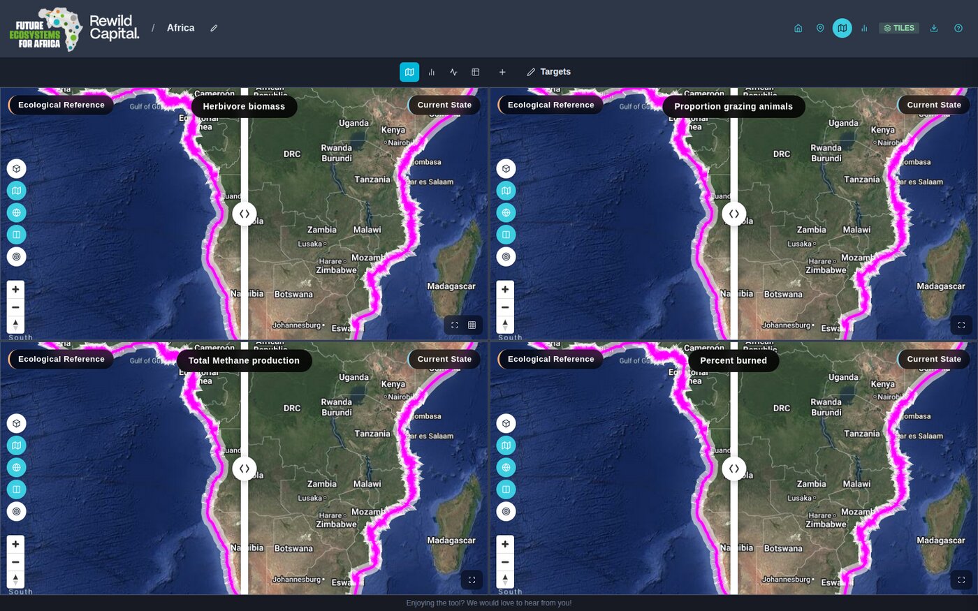
- Grid view -- 2x2 or 2x3 grid of independent panes, each with its own factor/scenario/view-mode selections. A shared top toolbar can set all panes to one view mode at once, add panes, and open Targets.
Indicator Panel
Slides in from the right (drag its left edge to resize, 320-720px).
| Component | Description |
|---|---|
| Create Site button | Shown only in Explore mode |
| Indicator heading + Pane badge | Identifies which pane the panel is editing |
| Zone Range | Full / Extent / Site toggle (hidden for Dial view, which has its own inline toggle) |
| Factor field | Searchable attribute dropdown (non-chart views) |
| Individual Factor / Variable Type fields | Chart view only -- pick a single factor, or a category to compare in bulk, with an optional Grouping Variable and Line/Boxplot toggle |
| Scenario 1 (Left) / Scenario 2 (Right) | Dropdowns for Ecological Reference / Current State / Target State, each with a description and, where available, min/mean/max statistics for the current zone range |
| Color Scale (Domain Range) | Scale-type control (currently Linear) and a gradient legend bar |
View Modes
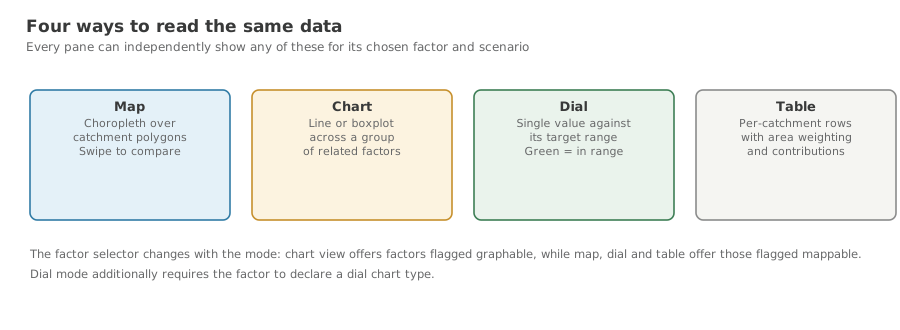
Switch a pane's view mode from its per-pane toolbar. See Scenario Comparison for how to configure each one.
| Mode | Shows |
|---|---|
| Map | Choropleth map, described above |
| Chart | 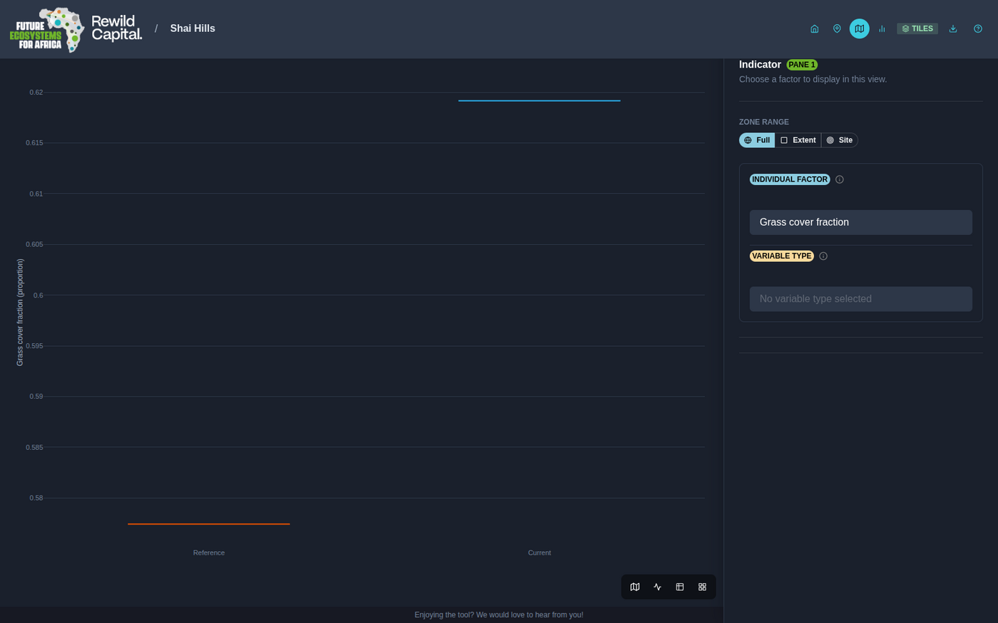 Line or boxplot comparison of Reference/Current/Target for one factor, or a whole Variable Type category Line or boxplot comparison of Reference/Current/Target for one factor, or a whole Variable Type category |
| Dial | 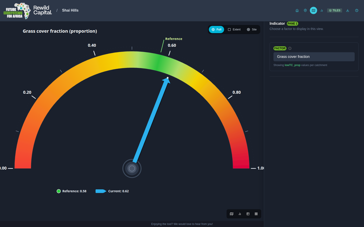 Gauge showing Current and Target relative to the Ecological Reference band Gauge showing Current and Target relative to the Ecological Reference band |
| Table | 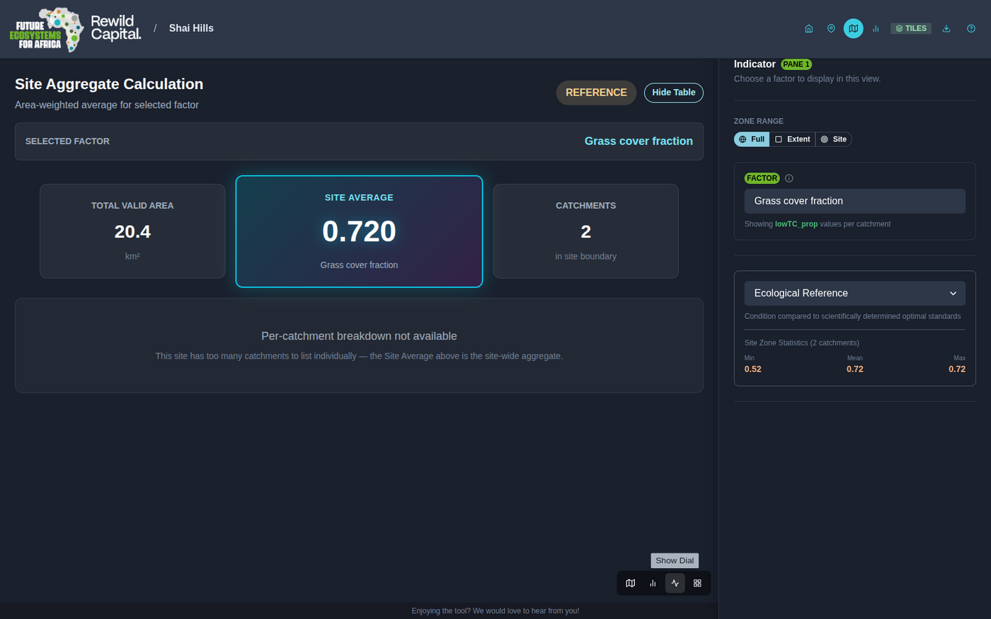 Site Aggregate Calculation -- area-weighted average, with an optional per-catchment breakdown Site Aggregate Calculation -- area-weighted average, with an optional per-catchment breakdown |
Targets Panel
Opened via the Targets button in the grid-view toolbar, once a site has indicators. It docks into the right-hand side panel -- the same slot the single-factor controls use, so only one of the two is open at a time -- and the views shrink to make room rather than being covered. The dials, charts and maps stay visible while you drag, which is the point: you are watching them answer the slider.
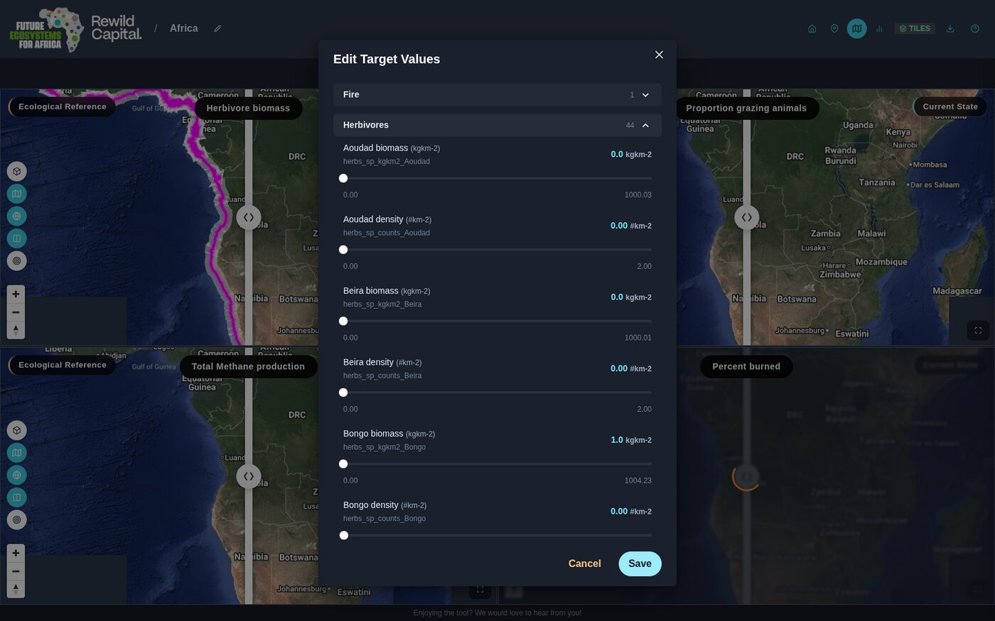
| Component | Description |
|---|---|
| Live update | Whether targets recalculate continuously while you drag, or once you let go. See below |
| Category accordion | Collapsible groups (e.g. Fire, Herbivores, Vegetation Structure) with an indicator count |
| Slider rows | One per indicator, showing current value, unit, and min/max range |
| Close | Dismisses the panel. Edits apply as you make them -- there is nothing to save |
Only the sliders you actually move are submitted. Dragging one back to where it started clears the target you set for it.
Live update
Every target edit costs a recalculation that rescores each catchment in the site, so its cost grows with how many catchments the site has.
| Setting | Behaviour |
|---|---|
| On | Sliders, dials and charts recalculate continuously as you drag |
| Off | Everything recalculates once you release a slider |
The box is ticked by default on sites of 20 catchments or fewer, and cleared by default on larger ones. Ticking or clearing it yourself replaces that judgement permanently: your choice is remembered across sites and sessions, and the catchment count stops being consulted. Turn it on for a large site if your machine and connection can keep up; turn it off for a small one if you would rather not recalculate mid-drag.
With live update on, a drag never queues up a backlog of requests. At most one recalculation is in flight at a time, and movement made while it runs collapses into a single follow-up, so the result always converges on the value you actually let go at.
Indicators Page
Reached via the header's Indicators icon.
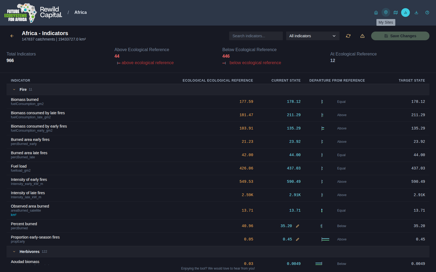
| Component | Description |
|---|---|
| Summary stats | Total Indicators, Above/Below/At Ecological Reference counts |
| Search box / category filter | Narrow the indicator table |
| Refresh | Re-extracts indicators from the site's catchments |
| Reset | Reverts every Target value back to Current (confirmation required) |
| Save Changes | Enabled once a value has been edited |
| Indicator table | Grouped, collapsible rows: Ecological Reference / Current State / departure trend glyph / Target State, with inline edit (pencil) on editable cells |
| Extract Indicators | Shown instead of the table when the site has no indicators yet |
Boundary Edit Mode
Toggled from the header's pencil icon, map page only.
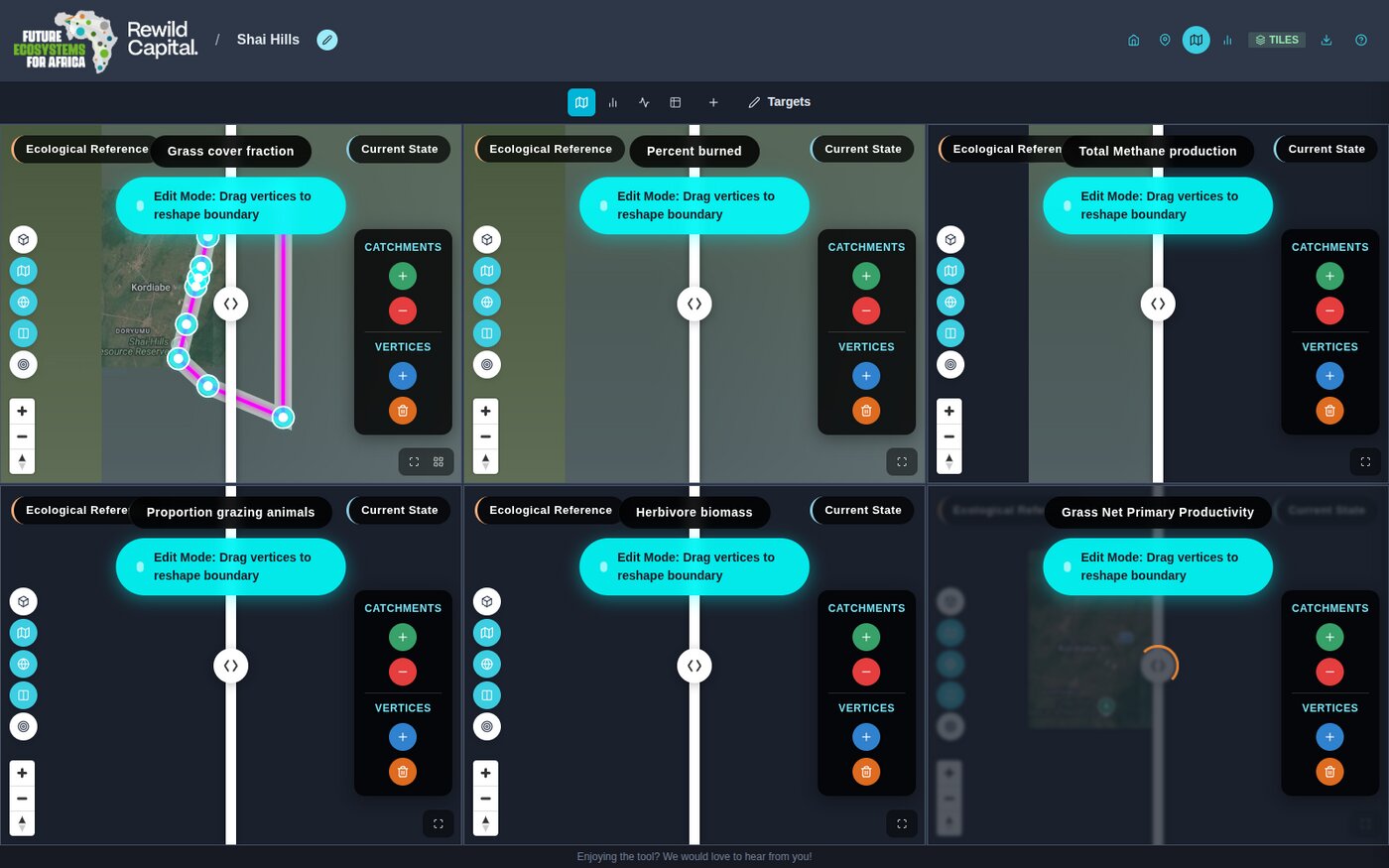
| Component | Description |
|---|---|
| Edit Mode banner | Names the current sub-mode |
| Add / Remove catchments | Green + / red − buttons; click a catchment to union/subtract it |
| Add / Delete vertices | Blue + / orange trash buttons; click the boundary to insert a vertex, or a vertex to delete it |
| Vertex handles | Glowing cyan dots; drag directly to reshape when no tool is selected |
Edits auto-apply as you go -- there is no separate save step.
Navigation Flow
Landing Page
├── Guided Tour (onboarding walkthrough overlay)
├── Explore → Map View (no site)
├── Demo tour cards → Map View (read-only demo site)
├── Partnership Page
│   └── Back to Landing
└── My Sites
    ├── Create New Site → 3-step wizard → Map View
    └── Site Card (click) → Map View
        ├── Home icon → Landing Page
        ├── My Sites icon → Your Sites
        └── Indicators icon → Indicators Page